Style Vault / Bold / Two-Color Acid
Two-Color Acid
SV-034
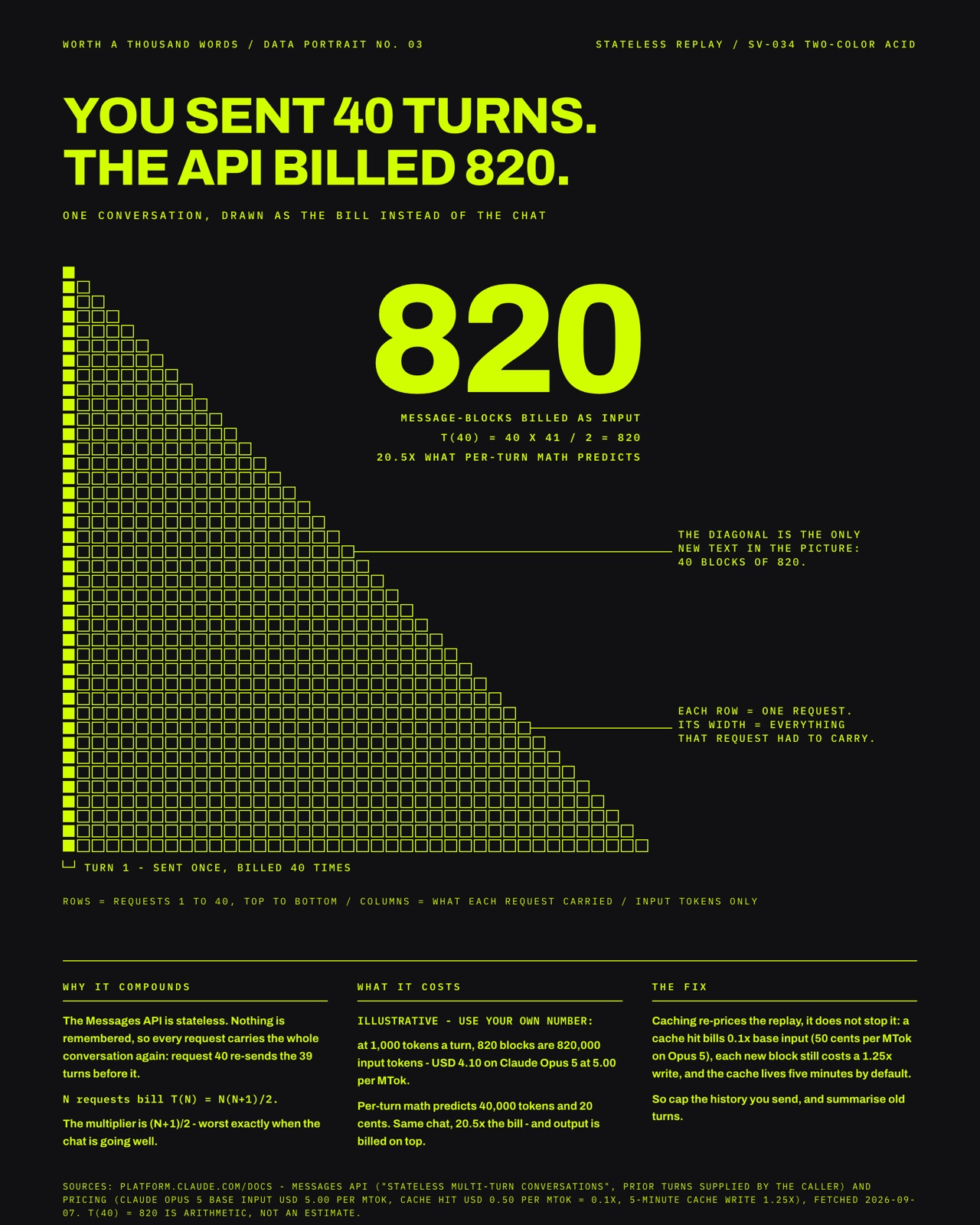
My own work in this style: You sent 40 turns. The API billed 820.
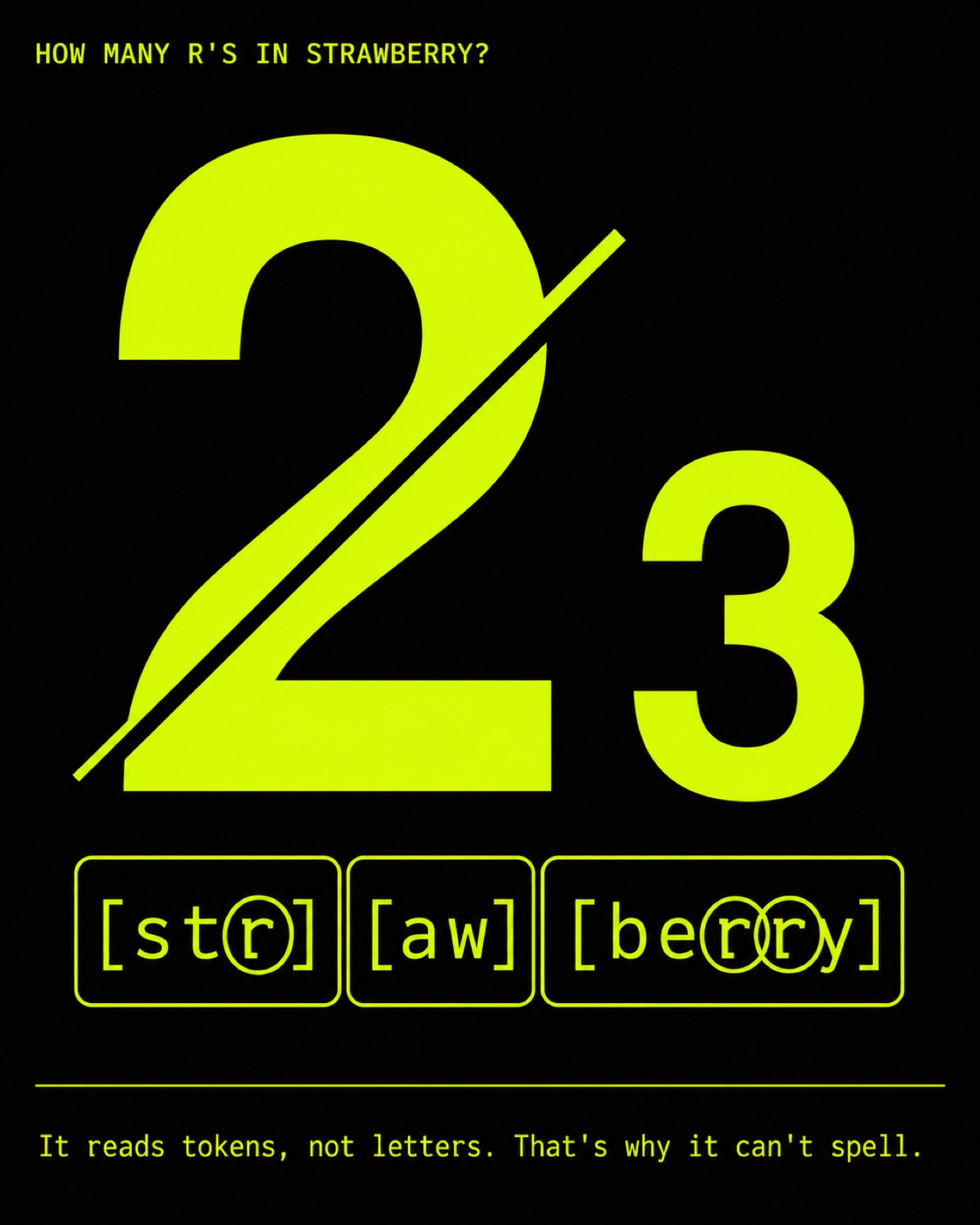
The model can't spell strawberry
In plain words
A poster in exactly two colours, an acid lime and near-black, with one hero number or object in the bright colour and everything else quiet in the dark. Lots of empty space, tiny corner labels and no gradients make it feel sharp and premium. The style works because the bright colour only ever marks the one thing that matters.
Topics it fits
- Headline KPI for the boardthe single accent colour reserved for one number makes that figure impossible to miss
- Product or feature launchtwo loud colours and one hero object give a launch card high energy without clutter
- Keynote stat revealsone lime number on near-black lands like a punchline on a big screen
- Risk exposure headlinethe accent marking only the exposure figure tells executives exactly where to look
Art style and layout
- core locked [palette_rule, color_meaning, contrast, negative_space, hierarchy]
- medium flat vector editorial poster - no gradients, no photoreal texture
- palette rule EXACTLY two colors - acid lime #D2FF00 + near-black #111112. No white, no gray, no third hue. The accent can rotate to any single loud color on near-black, but ALWAYS one accent only.
- color meaning SIGNATURE - the accent = 'the one important thing' (the hero figure/number). Near-black = ground + everything secondary. The accent is NEVER decorative.
- linework crisp geometric shapes; thin hairline rules allowed, in the accent
- typography bold neo-grotesque for the hero (Helvetica / Akzidenz / Druk feel); tiny mono caps for spec labels
- hierarchy one dominant hero element passes the two-second rule; everything else pushed one layer back, small and quiet
- negative space massive - the hero floats in a field of near-black
- contrast maximal accent-on-black; no mid-tones
- composition single hero centered or slightly offset, Swiss grid discipline, tiny corner spec labels, one hairline rule
- mood confident, high-energy, premium-tech, editorial
- palette [acid lime "#D2FF00, near-black "#111112]
- era reference Swiss International Typographic (Müller-Brockmann geometry) x contemporary sports/tech brand (Lando Norris / OFF+BRAND)
What must stay, what may change
Swap the hero subject/number and the quiet secondary content freely. Rotate the single accent color if desired. NEVER add a third color, NEVER use gradients, NEVER let the accent decorate - it marks meaning only.
As JSON
Paste this into a prompt or a skill to reuse the style.
{
  "id": "SV-034",
  "name": "Two-Color Acid",
  "audience": [
    "bold",
    "board"
  ],
  "category": [
    "graphic-design",
    "typography",
    "data-viz"
  ],
  "format": [
    "poster",
    "typographic"
  ],
  "maker": "diffusion-nonmj",
  "keep_and_swap": "Swap the hero subject/number and the quiet secondary content freely. Rotate the single accent color if desired. NEVER add a third color, NEVER use gradients, NEVER let the accent decorate - it marks meaning only.",
  "style_dna": {
    "core_locked": "[palette_rule, color_meaning, contrast, negative_space, hierarchy]",
    "medium": "flat vector editorial poster - no gradients, no photoreal texture",
    "palette_rule": "EXACTLY two colors - acid lime #D2FF00 + near-black #111112. No white, no gray, no third hue. The accent can rotate to any single loud color on near-black, but ALWAYS one accent only.",
    "color_meaning": "SIGNATURE - the accent = 'the one important thing' (the hero figure/number). Near-black = ground + everything secondary. The accent is NEVER decorative.",
    "linework": "crisp geometric shapes; thin hairline rules allowed, in the accent",
    "typography": "bold neo-grotesque for the hero (Helvetica / Akzidenz / Druk feel); tiny mono caps for spec labels",
    "hierarchy": "one dominant hero element passes the two-second rule; everything else pushed one layer back, small and quiet",
    "negative_space": "massive - the hero floats in a field of near-black",
    "contrast": "maximal accent-on-black; no mid-tones",
    "composition": "single hero centered or slightly offset, Swiss grid discipline, tiny corner spec labels, one hairline rule",
    "mood": "confident, high-energy, premium-tech, editorial",
    "palette": "[acid lime \"#D2FF00, near-black \"#111112]",
    "era_reference": "Swiss International Typographic (Müller-Brockmann geometry) x contemporary sports/tech brand (Lando Norris / OFF+BRAND)"
  },
  "palette_hex": [
    "#d2ff00",
    "#111112"
  ],
  "topics": [
    {
      "topic": "Headline KPI for the board",
      "why": "the single accent colour reserved for one number makes that figure impossible to miss"
    },
    {
      "topic": "Product or feature launch",
      "why": "two loud colours and one hero object give a launch card high energy without clutter"
    },
    {
      "topic": "Keynote stat reveals",
      "why": "one lime number on near-black lands like a punchline on a big screen"
    },
    {
      "topic": "Risk exposure headline",
      "why": "the accent marking only the exposure figure tells executives exactly where to look"
    }
  ]
}